
Roman Numeral Clock: Why IIII, How to Read It and How to Style It
The story behind Roman numeral dials, the IIII puzzle, readability tips and how to use a Roman numeral clock in your decor.
In this article
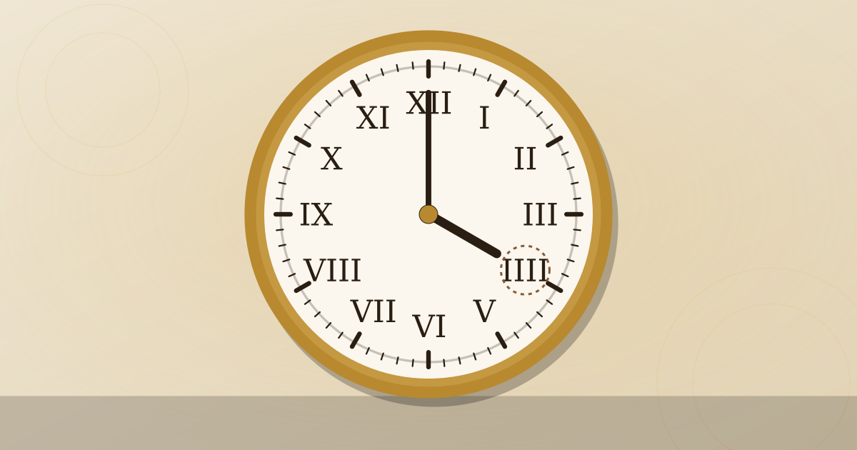
A Roman numeral clock is so familiar that most of us never stop to study it, until someone points out that the four is written IIII instead of IV. That small quirk opens up a surprising story about tradition, design and how we read time at a glance. Here we look at where Roman dials came from, the main theories behind IIII, how readable they really are, and how to use one well in your home.
A Short History of Roman Numerals on Clocks
Roman numerals were the standard way of writing numbers in Europe for centuries, and they appeared on sundials and on the earliest mechanical clock dials. As clockmaking developed in Europe from the late Middle Ages onward, Roman hours became the natural choice for dials, and the habit stuck.
By the time pendulum clocks spread in the second half of the 17th century, Roman numerals were firmly established on English longcase clocks, bracket clocks and French clocks alike. Arabic numerals became more common on dials much later, especially on railway, school and kitchen clocks where fast, unambiguous reading mattered most.
Today a Roman numeral clock signals tradition. You will see it on many floor clocks, mantel clocks and formal wall clocks. If you are curious about how dials fit into the rest of a tall clock, our complete grandfather clock guide walks through the anatomy from hood to base.
How the hours are written
Roman numerals build values from a few letters: I (1), V (5) and X (10) are all a clock needs. Placing a smaller numeral before a larger one subtracts it, so IX is 9. The full sequence on most clocks is:
| Hour | Usual dial form | Alternative |
|---|---|---|
| 1 | I | |
| 2 | II | |
| 3 | III | |
| 4 | IIII | IV |
| 5 | V | |
| 6 | VI | |
| 7 | VII | |
| 8 | VIII | |
| 9 | IX | |
| 10 | X | |
| 11 | XI | |
| 12 | XII |
Why So Many Clocks Show IIII Instead of IV
This is the question everyone asks. There is no single documented answer, and clock historians offer several explanations. More than one may be true.
Visual balance
The most widely accepted explanation is design. With IIII, the left side of the dial carries visual weight that mirrors VIII on the right. IIII also balances the “heavier” lower half of the dial. Many dial makers simply felt that IIII looked better, and the convention passed down through generations of craftspeople.
A regular pattern of letters
With IIII, the first four hours use only the letter I, the next four include V, and the last four include X. That creates a neat, regular pattern around the dial, which some people find easier to scan.
Practical manufacturing theories
Another theory suggests that casting numerals was more efficient with IIII, because the full set of hours could be made from a tidy number of I, V and X pieces. It is an appealing idea, though it is hard to prove.
Legends and old habits
You may hear stories that a particular king preferred IIII, or that IV was avoided because it resembled the start of a god’s name in Latin. These stories are often repeated but not well documented, so we treat them as legends. What is clear is that IIII was already a common form in older writing and on sundials, and clockmakers kept using it.
Clocks that use IV
Not every Roman numeral clock uses IIII. The Great Clock at the Palace of Westminster, home of the bell known as Big Ben, famously shows IV on its dials. Some designers and makers also choose IV for a more “correct” or modern look. Both forms are accepted, so neither is a mistake.
Readability: Are Roman Numerals Practical?
Roman dials are slightly slower to read for some people, especially children and anyone less familiar with the system. In practice, most of us read clocks by the position of the hands rather than the numerals themselves, so a well-designed Roman dial is easy to use once it is familiar.
What makes a Roman numeral clock easy to read:
- Strong contrast, such as black numerals on a white or cream dial, or the reverse.
- A clear minute track with marks for every minute or every five minutes.
- Well-proportioned hands: the hour hand should reach the numerals, the minute hand should reach the minute track.
- Sensible numeral size for the viewing distance.
- A legible typeface, whether classic serif or modern sans-serif.
Radial or upright numerals
On many traditional dials, the numerals are arranged radially, so their bases point toward the centre and VI appears upside down. Others keep every numeral upright. Radial numerals look classic and balanced; upright numerals are often easier to read at a glance, especially from across a room.
| Feature | Easier to read | More traditional |
|---|---|---|
| Numeral orientation | Upright | Radial |
| Typeface | Bold sans-serif | Serif |
| Dial colour | High contrast | Silvered, aged |
| Minute marks | Every minute | Outer track only |
| Hands | Simple, contrasting | Ornate, pierced |
Choosing a Roman Numeral Clock for Your Space
A Roman dial works in almost any setting, but the style of numerals, the dial and the case should suit the room.
- Decide the role of the clock. Is it a focal point, a practical timepiece or both?
- Consider viewing distance. For a large wall over a sofa or staircase, choose bigger, bolder numerals. Our guide to large wall clocks has sizing rules that apply directly.
- Match the case to the room. A dark wood case suits traditional rooms; a thin black or brass frame suits modern ones.
- Choose the right movement. Quartz is simple and accurate; mechanical clocks offer chimes and a real tick.
- Check the four. If IIII versus IV matters to you, look closely at photos before buying.
Styling Ideas With Roman Numeral Dials
Roman numerals carry a sense of history, which makes them useful for adding character to a room.
Traditional rooms
In a living room with wood furniture and a fireplace, a mantel or floor clock with a silvered or painted dial and serif Roman numerals feels natural. A chiming movement adds to the atmosphere. Our mantel clock guide covers tambour, bracket and Art Deco shapes that pair well with Roman dials.
Modern and minimalist rooms
Try oversized Roman numerals on a frameless wall clock, or a slim black dial with white numerals. The contrast between the classic numerals and a clean interior is often the point. In open-plan condos, one large Roman dial can define a dining or living zone.
Farmhouse and cottage style
Distressed wood, cream dials and black iron hands are a common look in Canadian cottages and farmhouse-style homes. Keep the numerals simple and slightly weathered for the best effect.
Statement pieces
Skeleton dials with cut-out Roman numerals, gear-themed designs and mixed-metal clocks all use Roman numerals to striking effect. For more ideas, see our roundup of unique wall clocks in Canada.
Care for Dials and Numerals
Painted and printed dials are delicate. To keep the numerals crisp:
- Do not wipe the dial with water or cleaning sprays.
- Keep the clock out of direct sun, which fades paint and printed dials.
- Avoid placing it above heating vents; dry, hot air can crack old painted dials and wood cases.
- On antique clocks, leave dial cleaning and restoration to a specialist, since a poor touch-up can reduce value.
- Dust the glass and case with a soft, dry cloth.
In Canadian winters, stable humidity helps both the case and the dial. A humidifier in very dry months is a simple safeguard.
Final Thoughts: Picking a Roman Numeral Clock You Love
A Roman numeral clock brings history and a sense of craft to a room, and the IIII on its dial is a small, deliberate nod to centuries of clockmaking tradition. When choosing one, think about readability first (contrast, numeral size and a clear minute track), then match the dial style to your space. Whether you prefer a traditional serif dial or a bold modern version, you will be choosing a design that has stood the test of time.
Frequently Asked Questions
Is IIII on a clock a mistake?
No. Using IIII for four is a long-standing convention in clock and watch making, and it appears on many fine clocks. IV is also correct, and some famous clocks use it. Both are accepted on dials.
Are Roman numeral clocks harder to read for children?
They can be at first, because children usually learn Arabic numbers before Roman ones. Many families find that a Roman dial becomes easy to read once the positions of the hours are familiar. A clock with clear minute markers helps.
Do Roman numerals suit a modern home?
Yes, especially in a clean, sans-serif style or on an oversized minimalist dial. Pairing Roman numerals with a simple frame in black, white or brushed metal keeps the look current. The contrast between a classic dial and a modern room can be very effective.
What is the chapter ring on a clock?
The chapter ring is the band on the dial where the hour numerals are placed. On many traditional clocks it is a separate ring, sometimes silvered or enamelled. Its proportions have a big effect on how readable and balanced the dial looks.